The TLB Brand
Our brand represents trust, clarity, and simplicity in land ownership. These guidelines ensure TLB is represented consistently across all touchpoints.
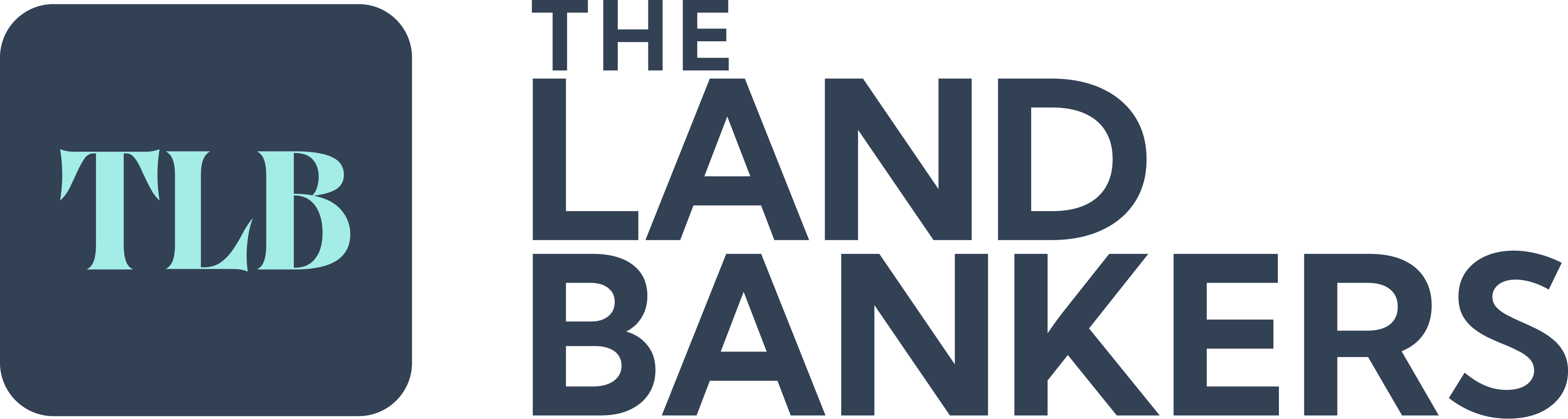
Our logo
The TLB logo is the primary identifier of our brand. It should always be displayed clearly with adequate spacing and never be altered, distorted, or recoloured beyond the approved variations.
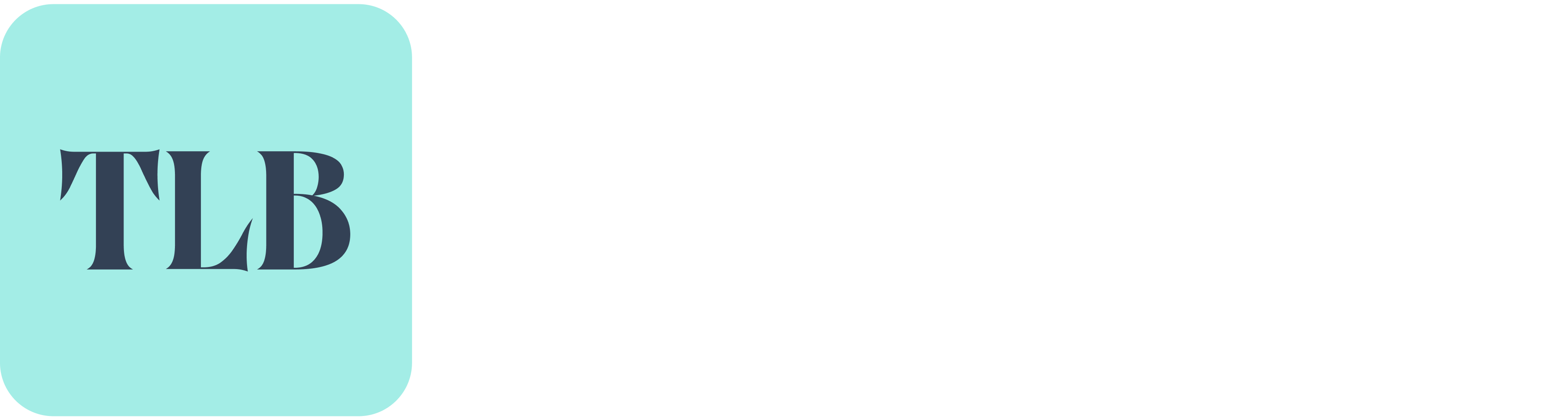
 Primary — on light backgrounds
 Reversed — on dark backgrounds
Clear space
Always maintain a minimum clear space around the logo equal to the height of the "T" in TLB. This ensures the logo remains legible and uncluttered in any context.
Logo usage guidelines
Do
- Use the official logo files provided in the brand kit
- Maintain minimum clear space around the logo
- Use the dark logo on light backgrounds
- Use the white logo on dark or teal backgrounds
- Scale proportionally — never stretch or squash
- Place the logo on clean, uncluttered backgrounds
Don't
- Alter the logo colours beyond approved variants
- Add effects like shadows, gradients, or outlines
- Rotate, skew, or distort the logo in any way
- Place the logo on busy or low-contrast backgrounds
- Recreate the logo using other fonts or shapes
- Use the logo at sizes smaller than 24px in height
Colour palette
Our palette is built around TLB Teal — a colour that communicates trust, clarity, and progress. It is paired with a neutral dark system that keeps interfaces clean and professional.
TLB Teal
#30B0A4
TLB Teal 400 — Primary brand colour
Teal 50
#F0FAF9
Light backgrounds, subtle highlights
Teal 100
#D4F0ED
Badges, borders, hover states
Teal 200
#A8E2DB
Accents, progress indicators
Teal 300
#6DCEC5
Secondary accents
Teal 400
#30B0A4
Primary brand color
Teal 500
#289990
Active states, links
Teal 600
#207B74
Dark accents, text on light
Teal 700
#1A635E
Gradient endpoints
Dark & Neutral
Dark 900
#0C1421
Footer, dark sections
Dark 800
#101828
Primary text, headings, buttons
Dark 700
#1A2332
Hover states on dark buttons
Slate 700
#334155
Secondary text, body copy
Gray 600
#475467
Muted text, descriptions
Gray 500
#667085
Subtle text, placeholders
Gray 300
#98A2B3
Disabled states, dividers
Gray 100
#F0F1F3
Borders, card backgrounds
DM Sans
DM Sans is a geometric sans-serif typeface designed for clarity at any size. It is our sole typeface across all products, marketing, and communications — keeping the brand unified and legible.
Aa
ABCDEFGHIJKLMNOPQRSTUVWXYZ
abcdefghijklmnopqrstuvwxyz
0123456789 !@#$%&*()
Light 300
Subtle subheadings, decorative text
Regular 400
Body text, paragraphs
Medium 500
Labels, navigation links
Semibold 600
Subheadings, card titles
Bold 700
Headings, section titles
Extrabold 800
Hero headlines, key statements
Type scale
How we speak
TLB communicates with clarity and confidence. Our language is approachable but never casual, informed but never intimidating. We help people understand land — not impress them with jargon.
Clear
We use simple, direct language. If a concept is complex, we break it down. No legal jargon without explanation.
Trustworthy
We never overpromise. We state what we do, what we don't, and are transparent about limitations and data practices.
Helpful
Every piece of communication should leave the reader with something useful — an answer, a next step, or clarity.
Grounded
We understand the real challenges of land ownership in India. Our tone reflects on-ground reality, not Silicon Valley hype.
Key design elements
Consistent use of these elements creates a cohesive brand experience across all platforms.
Gradient text
Land clarity
Used sparingly for hero headlines and key phrases. The gradient runs from Teal 400 to Teal 700 at 135 degrees.
linear-gradient(135deg, #30B0A4, #1A635E)Border radius
We use generous radii for a modern, approachable feel. Cards use 16px (2xl), inputs use 12px (xl), and buttons use full rounding.
Content width
Max content width is 1280px with 24px horizontal padding (32px on large screens). Text sections cap at 576px for readability.
Need something specific?
If you need brand assets in a specific format, co-branding guidelines, or have questions about usage, reach out to our team.